


Modern TV Stand with Drawers for TVs up to 75'', Media Console Storage Cabinet Entertainment Center Furniture, Glam TV Console w
SPECIFICATIONS
Appearance: Modern Style
General Use: Home Furniture
High-concerned chemical: None
Installation Method: Assembly
Material: Wooden
Product Care Instructions: Wipe with Damp Cloth
Shape: Rectangular
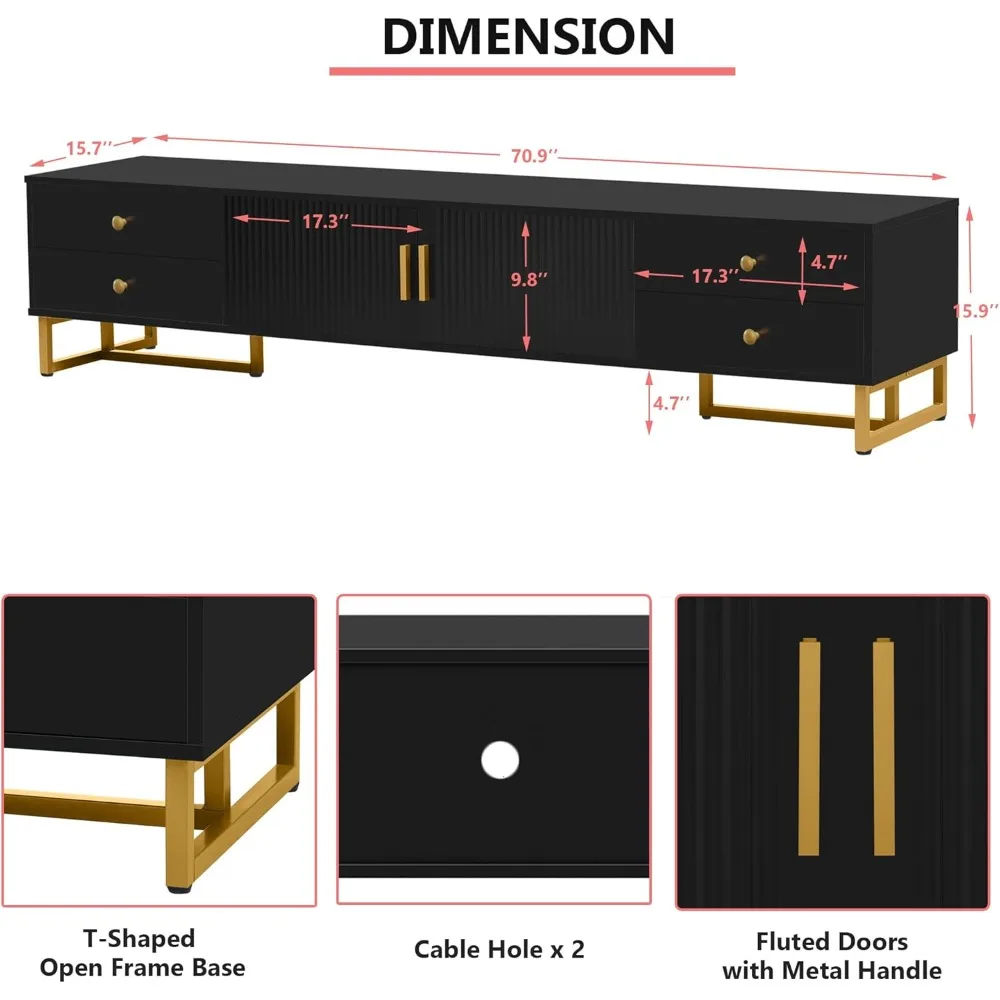
Size: 15.7 x 15.7 x 15.9 inches
Specific Use: TV Stand
Style: Modern
Type: Living Room Furniture
About this item
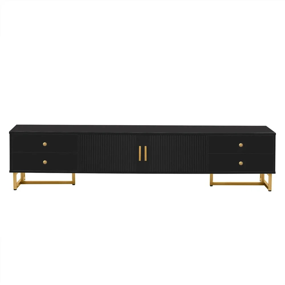
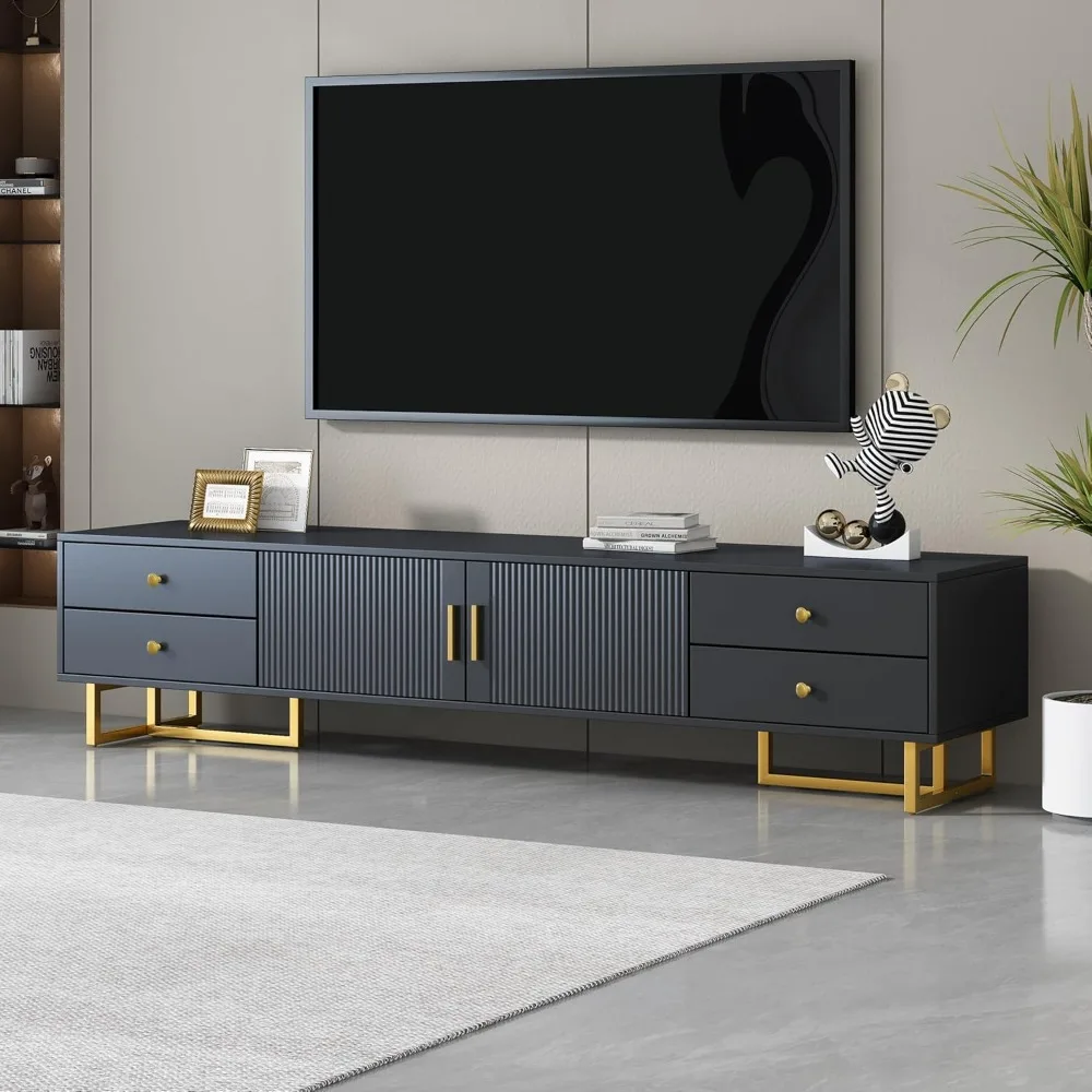
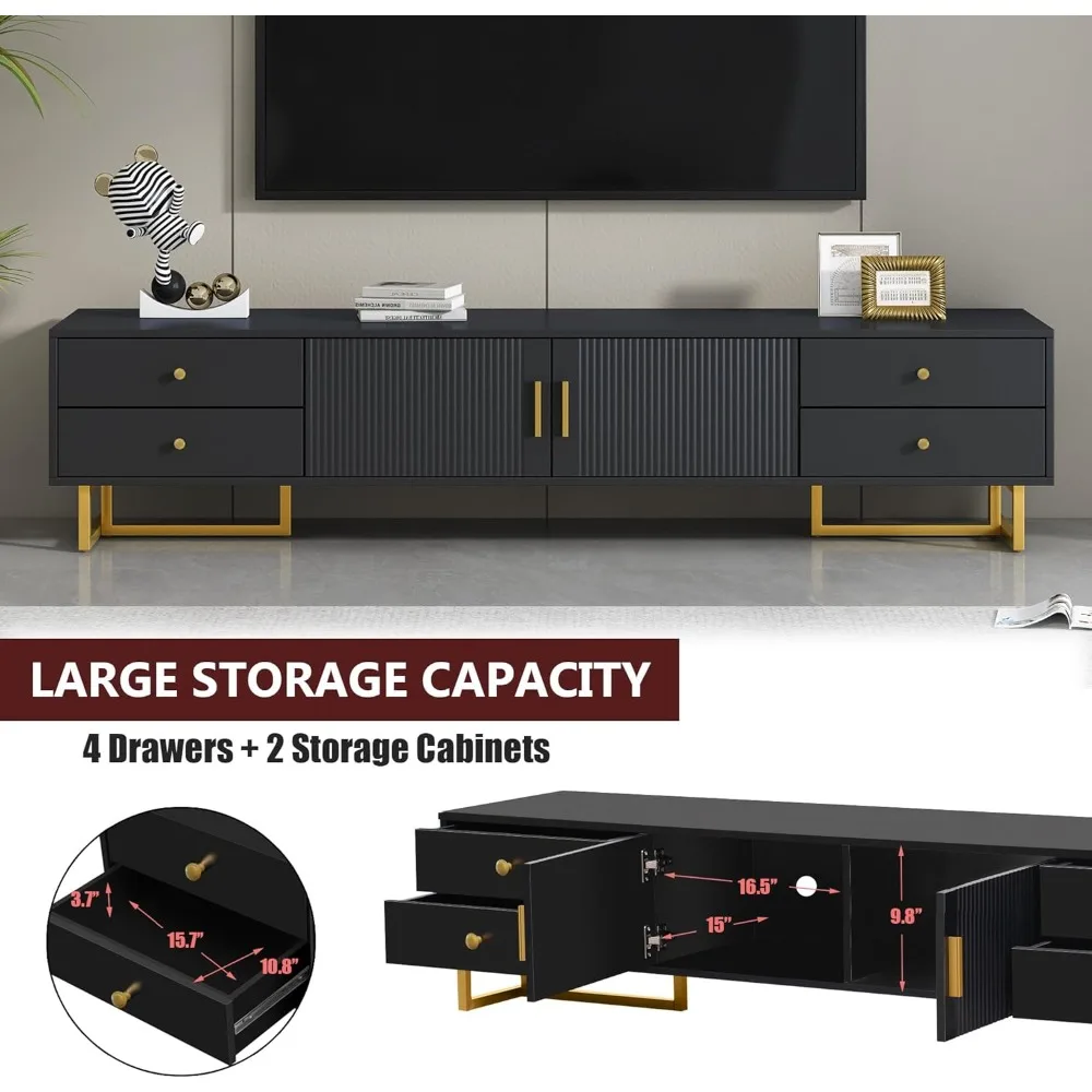
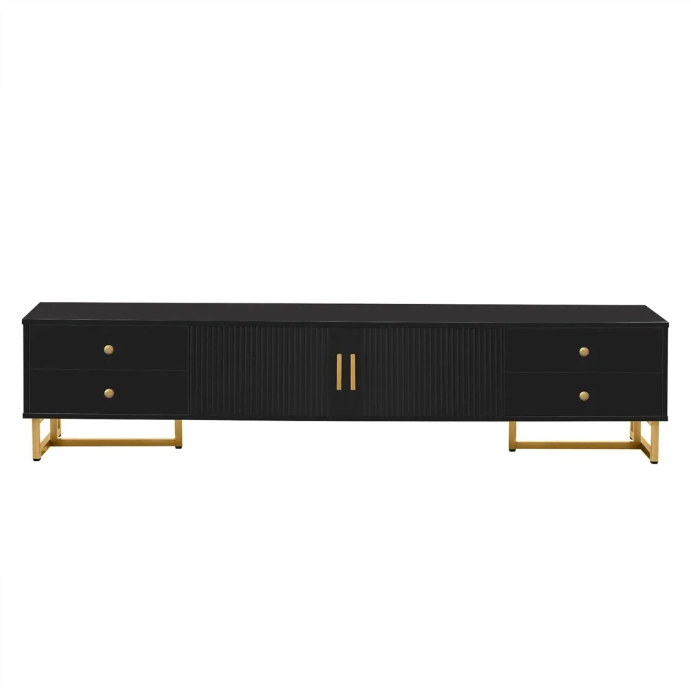
Overall Dimension: 70.9’’L x 15.7’’D x 15.9’’H, this low-profile tv stand can fit TVs up to 75-inch.
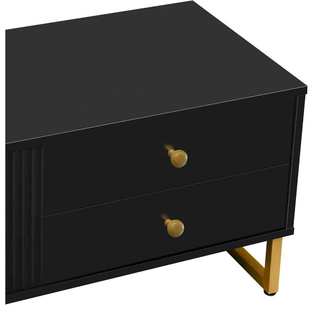
This stylish TV stand is well constructed of quality MDF board with sturdy metal open frame base, ensuring a reliable and stable construction. Its capacious top can hold up to 99 lbs.
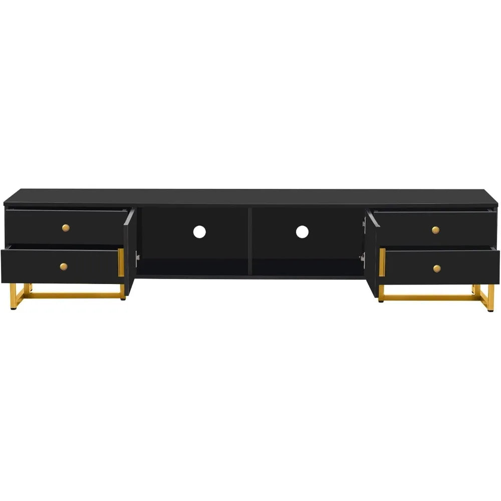
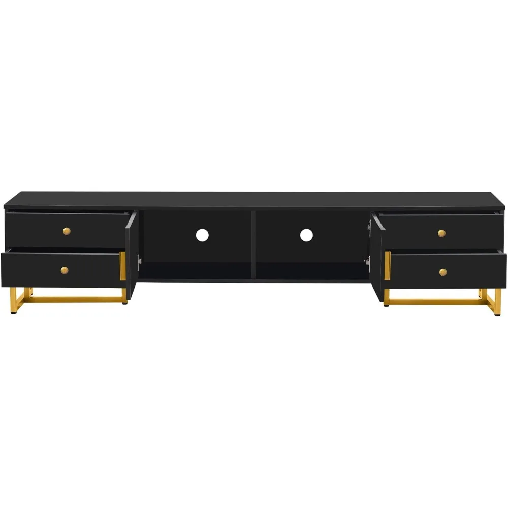
Features cable management system and ample storage space for clutter-free organization. There are 2 double door storage cabinets with shelf providing tons of closed space for media devices and accessories.
With linear silhouette, luxury metal legs and unique pattern details, this media console cabinet will surely satisfy your style for contemporary, adding minimalist aesthetics to your TV room.
Assembly Required. All necessary hardware and a detailed instruction are included for convenient installation. Any problem encountered during or after installation, please no hesitate to contact seller (Atglus)
width: 100%;
height: 100%;
background-repeat: no-repeat;
background-size: cover;
}.aplus-v2 .container-with-background-image {
width: 100%;
height: 100%;
background-repeat: no-repeat;
background-size: cover;
}.aplus-v2 .apm-brand-story-carousel-container {
position: relative;
}
.aplus-v2 .apm-brand-story-carousel-hero-container,
.aplus-v2 .apm-brand-story-carousel-hero-container > div {
position: absolute;
width: 100%;
}/*
Ensuring the carousel takes only the space it needs.
The sizes need to be set again on the absolutely positioned elements so they can take up space.
*/
.aplus-v2 .apm-brand-story-carousel-container,
.aplus-v2 .apm-brand-story-carousel-hero-container {
height: 625px;
width: 100%;
max-width: 1464px;
margin-left: auto;
margin-right: auto;
overflow: hidden;
}
.aplus-v2 .apm-brand-story-carousel-hero-container,
.aplus-v2 .apm-brand-story-carousel-hero-container > div {
height: 625px;
}.aplus-v2 .apm-brand-story-carousel.a-carousel-container {
padding: 0px;
}
/*
This centers the carousel vertically on top of the hero image container and after the logo area (125px).
Margin-top = (heroHeight - cardHeight - logoAreaHeight) / 2 + logoAreaHeight
*/
.aplus-v2 .apm-brand-story-carousel .a-carousel-row-inner {
margin-top: 149px;
}
/*
Cards need to have a width set, otherwise they default to 50px or so.
All cards must have the same width. The carousel will resize itself so all cards take the width of the largest card.
The left margin is for leaving a space between each card.
*/
.aplus-v2 .apm-brand-story-carousel .a-carousel-card {
width: 362px;
margin-left: 30px !important;
}
/* styling the navigation buttons so they are taller, flush with the sides, and have a clean white background */
.aplus-v2 .apm-brand-story-carousel .a-carousel-col.a-carousel-left,
.aplus-v2 .apm-brand-story-carousel .a-carousel-col.a-carousel-right {
padding: 0px;
}
.aplus-v2 .apm-brand-story-carousel .a-carousel-col.a-carousel-left .a-button-image,
.aplus-v2 .apm-brand-story-carousel .a-carousel-col.a-carousel-right .a-button-image {
border: none;
margin: 0px;
}
.aplus-v2 .apm-brand-story-carousel .a-carousel-col.a-carousel-left .a-button-image .a-button-inner,
.aplus-v2 .apm-brand-story-carousel .a-carousel-col.a-carousel-right .a-button-image .a-button-inner {
background: #fff;
padding: 20px 6px;
}
.aplus-v2 .apm-brand-story-carousel .a-carousel-col.a-carousel-left .a-button-image .a-button-inner {
border-radius: 0px 4px 4px 0px;
}
.aplus-v2 .apm-brand-story-carousel .a-carousel-col.a-carousel-right .a-button-image .a-button-inner {
border-radius: 4px 0px 0px 4px;
}


